
Surprising Animated Map Of The Growing Obesity Problem In The U.S.
The infographic we posted of how much exercise it would take to work off a McDonalds meal got a really good response.
Because we strive here at BayBusinessHelp.com to bring you value information for you as a business owner as well as you as an indiviual, we thought we’d share these stats and this map with you.
It shows some really eye-opening information about the state of obesity here in the United States.
“The History of State Obesity Prevalence
- There was a dramatic increase in obesity in the United States from 1990 through 2010.
- State prevalence prior to 2011 is provided for historical information only. Historical rates should not be compared to 2011 state obesity prevalence due to changes in survey methods.
- No state met the nation’s Healthy People 2010
 goal to lower obesity prevalence to 15%. Rather, in 2010, there were 12 states with an obesity prevalence of 30%. In 2000, no state had an obesity prevalence of 30% or more. [Read article]
 - The animated map below shows the history of United States obesity prevalence from 1985 through 2010.”
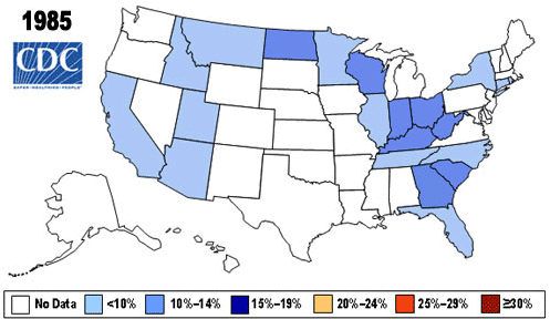
Source: CDC.gov
Related article
- Is It Possible? Could The Internet Be Ruining Your Health? (INFOGRAPHIC) (baybusinesshelp.com)
